September
In September 2026, the Operations Center gains more operational visibility, bringing more detail to track the operation, organized into the following topics: Live Operation, Automations, Efficiency, Capacity, and Schedule.
Operations Center
The Operations Center brings together, in one place, operational data that previously only existed in Insights, so you no longer need to switch modules to understand what's happening with your automations.
Full documentation
You can find the details of the Operations Center in the documentation:
Live Operation
The Live Operation tab gains three new summary cards: Alerts, Errors, and Datapool, in addition to the existing Scheduled tasks and Task processing cards.
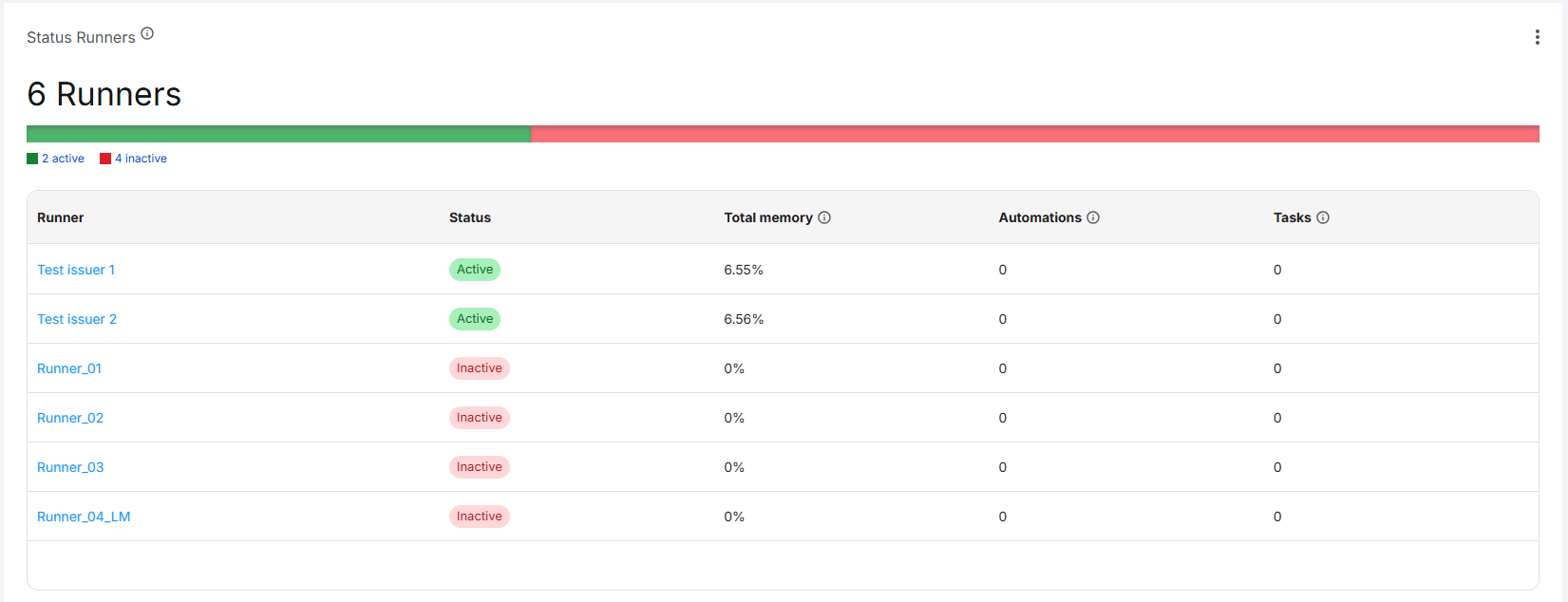
The former table with the latest automations was replaced by a Runners table, showing status, memory usage, number of automations, and total tasks over the last 60 minutes.
Automations
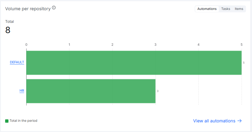
The Automations tab gains a new breakdown, Volume per repository, showing the repositories with the most automations, tasks, or items processed during the selected period.
Efficiency
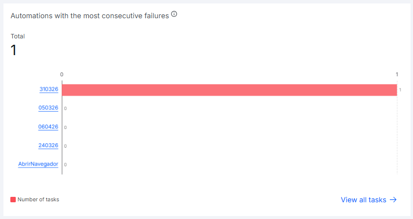
The Efficiency tab gains a new chart: Automations with the most consecutive failures, which identifies automations that failed repeatedly without any successful run between attempts, a pattern that usually indicates a critical issue that needs intervention.
Capacity
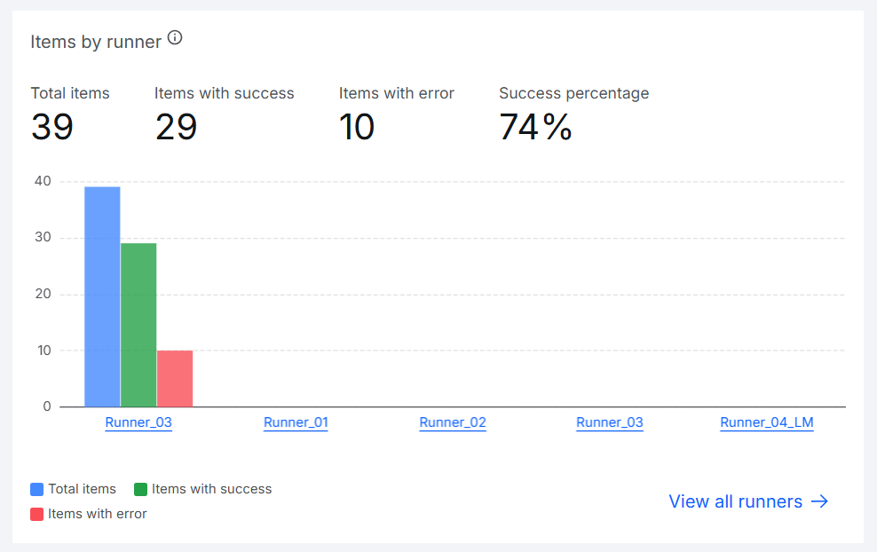
Items processed successfully and with errors per Runner, which were previously shown in two separate charts, now appear in a single chart, making it easier to compare Runners.