Efficiency
The Efficiency tab centralizes the historical view of the operation's failures and alerts. It helps you identify error patterns, prioritize fixes, and track the evolution of your automations' health over time.
Production tasks
Tasks marked as test are not counted in the indicators and charts.
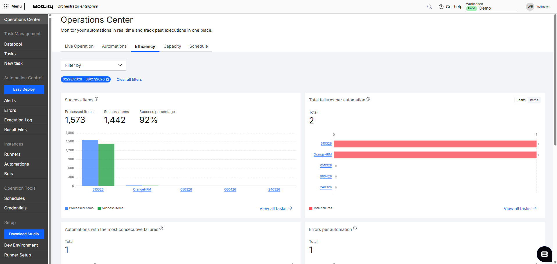
Charts
The tab's charts provide the historical view of failures and alerts in the selected period, cross-referencing success rate, failure ranking, consecutive failures, and the distribution of errors and alerts by automation and by Datapool to support fix prioritization.
Exact values
Hovering over the bars shows a tooltip with the exact values.
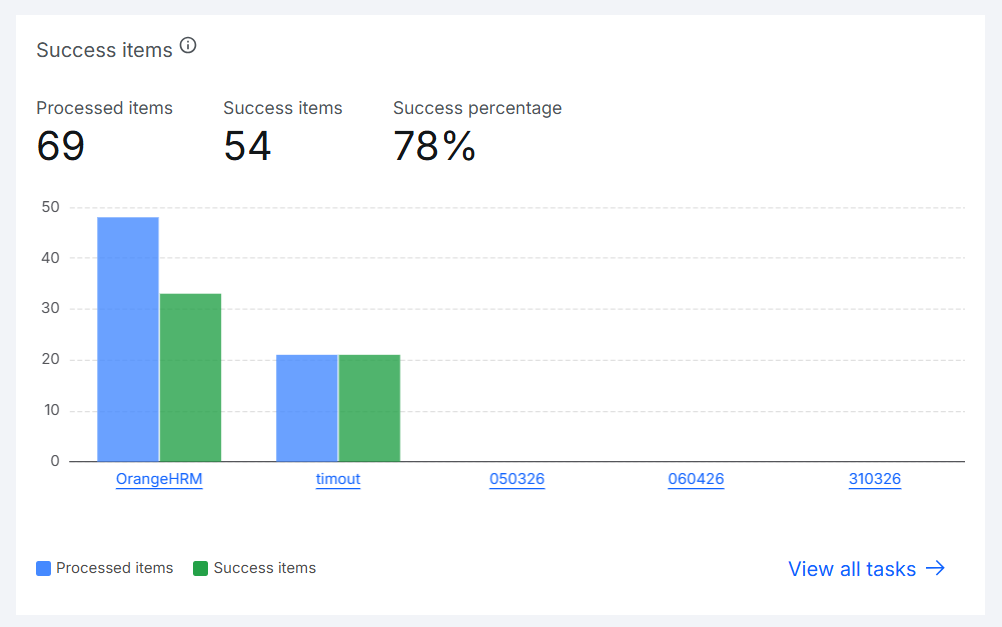
Success items
Shows three indicators at the top, referring to items processed in the selected period:
- Processed items: Total items sent for processing.
- Success items: Total items completed successfully.
- Success percentage: Percentage of items processed successfully out of the total processed.
Below the indicators, a grouped bar chart shows the top 5 automations with the most items processed, comparing side by side the total items processed and the items successfully processed for each one.
Automation name: Link that directs to the tasks menu filtered by the automation's success.See all tasks: Link that directs to the tasks menu in the Orchestrator.
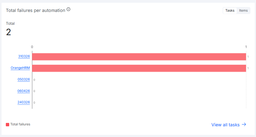
Total failures per automation
Shows the total failures in the selected period, with buttons to switch the metric between:
- Tasks: Total tasks finished with failure.
- Items: Total items processed with errors.
Below the indicator, a horizontal bar chart shows the top 5 automations with the most failures in the period, in descending order, making it easier to prioritize which automation needs attention first.
Automation name: Link that directs to the tasks menu filtered by the automation's failure.See all tasks: Link that directs to the tasks menu in the Orchestrator.
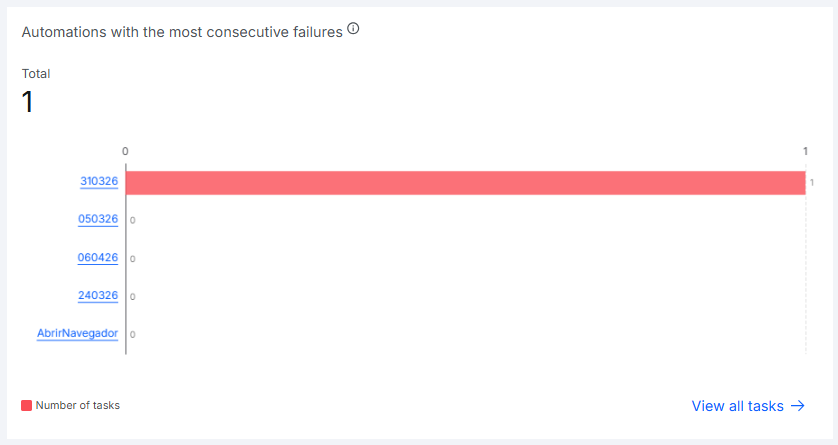
Automations with the most consecutive failures
Shows the total number of automations with consecutive failures in the selected period, that is, automations that failed repeatedly without any successful execution in between attempts. This pattern generally indicates a critical issue, since the automation doesn't recover on its own and requires intervention.
Below the indicator, a horizontal bar chart shows the top 5 automations with the most tasks in consecutive failures in the period, in descending order.
Automation name: Link that directs to the tasks menu filtered by the automation's failure.See all tasks: Link that directs to the tasks menu in the Orchestrator.
Repeated automation in the chart
If the same automation has two or more failure sequences separated by at least one success between them, each sequence is treated as an independent entry in the ranking. So a single automation can appear in more than one position on the chart.
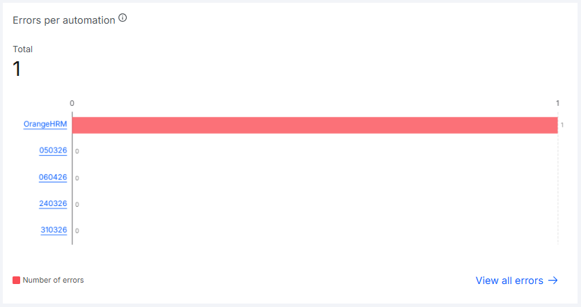
Errors per automation
Shows the total errors recorded in the selected period. Useful for understanding which automations concentrate the most occurrences and whether the volume is within the expected range.
Below the indicator, a horizontal bar chart shows the top 5 automations with the most errors in the period, in descending order.
Automation name: Link that directs to the errors menu filtered by the automation.See all errors: Link that directs to the Orchestrator's errors menu.
Alerts per automation
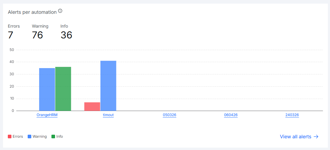
Shows three indicators at the top, referring to alerts triggered in the selected period, split by severity:
- Errors: Total alerts of the error type.
- Warning: Total alerts of the warning type.
- Info: Total informational alerts.
Below the indicators, a grouped bar chart shows the top 5 automations with the most alerts in the period, comparing side by side the amount of each severity per automation. Automations are ordered by the number of Errors, Warning, and Info occurrences, respectively, allowing you to identify which ones concentrate the most occurrences and of which type.
Automation name: Link that directs to the alerts menu filtered by the automation.See all alerts: Link that directs to the Orchestrator's alerts menu.
Error items per Datapool
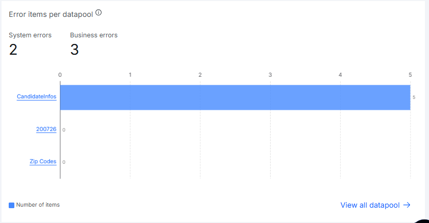
For workspaces with Datapool active, shows two indicators at the top, referring to items processed with errors in the selected period:
- System errors: Total items with a technical error during processing.
- Business errors: Total items with a business rule error from the automation.
Below the indicators, a horizontal bar chart shows the top 5 Datapools with the most items with errors of both types combined in the period, in descending order, helping to identify queues with recurring processing issues.
Datapool name: Link that directs to the Datapool's details.See all Datapools: Link that directs to the Datapool menu in the Orchestrator.
Filters
You can combine several filters at the top of the Efficiency tab to search according to your needs.
Available filters:
- Automation: Select one or more automations, with search available.
- Date: Default:
last month. Options:Today,1 day,1 week,15 days,1 month,6 months,custom. - Repository: Select a specific repository, with search available.
Filter persistence
Selected filters remain applied when navigating between the Operations Center tabs, preserving the context of your analysis.
Period
In the Efficiency tab, the searched period is always a maximum of 6 months.