Capacity
The Capacity tab provides the historical view of Runner usage and infrastructure availability. It's the right place to understand how your operation is being distributed over time, identify bottlenecks, and plan scaling before issues impact production.
Production tasks
Tasks marked as test are not counted in the indicators and charts.
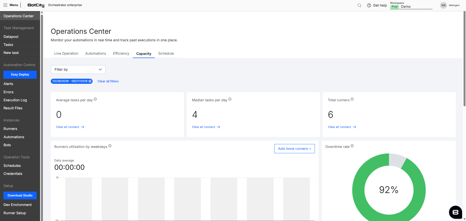
Summary Cards
The cards at the top provide a quick reading of the main indicators within the historical period:
- Average tasks per day: Average number of tasks executed per day in the selected period, calculated by dividing the total tasks by the number of days.
See all Runners: Link that directs to the Runners menu in the Orchestrator.
- Median tasks per day: Median number of tasks executed per day in the selected period, the middle value when the days are sorted by task volume.
See all Runners: Link that directs to the Runners menu in the Orchestrator.
- Total Runners: Total number of Runners available in the workspace.
See all Runners: Link that directs to the Runners menu in the Orchestrator.
Median calculation
The median calculation only considers days on which tasks were executed. For example, over a 30-day period, if 4 days had no tasks executed, those 4 days are excluded from the list of values used in the calculation.
From the remaining list of values, sorted in ascending order, the calculation follows two rules:
- Odd number of days: The median is the middle value of the list.
- Even number of days: The median is the average of the two middle values of the list.

Charts
The tab's charts provide the historical view of infrastructure usage in the selected period, cross-referencing Runner utilization by day of the week, processed items with success and error, and utilization versus available capacity per Runner to support scaling planning.
Exact values
Hovering over the bars shows a tooltip with the exact values.
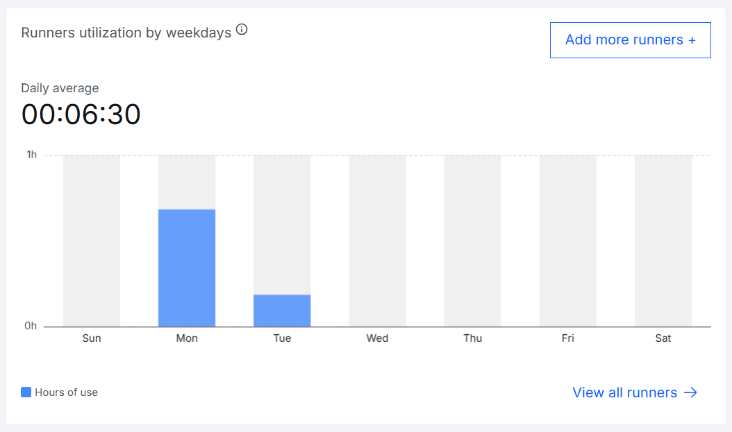
Runners utilization by weekdays
Shows the daily average hours of use indicator and, below, a bar chart with the total hours of use of the Runners on each day of the week in the selected period. Allows you to identify which days concentrate the highest utilization and plan capacity reinforcement for those periods.
Add more Runners: Button that directs to hiring new Runners.See all Runners: Link that directs to the Runners menu in the Orchestrator.
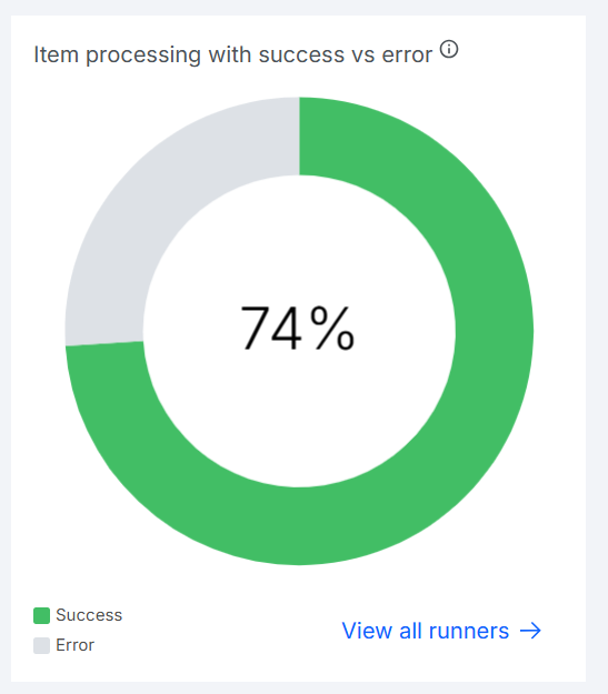
Item processing with success vs error
Shows a donut chart with the percentage of items processed successfully relative to the total processed by the Runners in the selected period, distinguishing between successful items and items with errors.
See all Runners: Link that directs to the Runners menu in the Orchestrator.
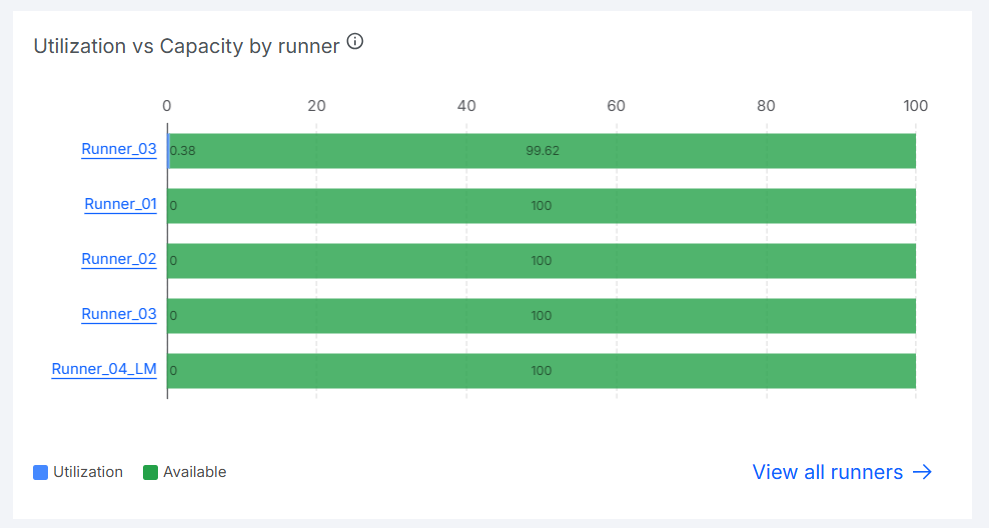
Utilization vs Capacity by Runner
Shows, for each Runner, the percentage of capacity used and the percentage still available in the selected period. Allows you to identify Runners near their maximum utilization limit and Runners with idle capacity that could absorb more load.
Runner name: Link that directs to the Runner's details.See all Runners: Link that directs to the Runners menu in the Orchestrator.
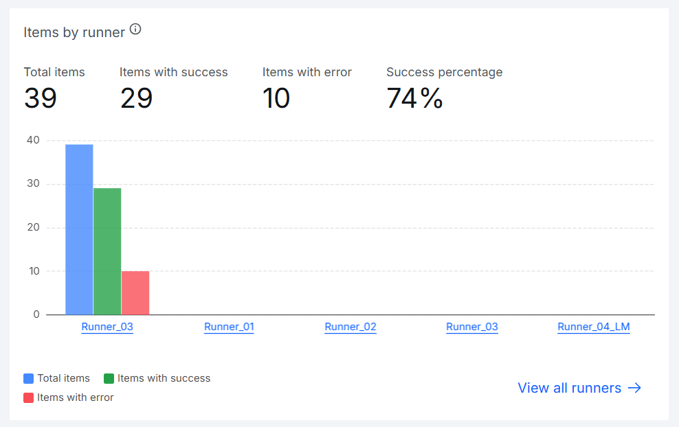
Items by Runner
Shows four indicators at the top, referring to items processed by the Runners in the selected period:
- Total items: Total items processed.
- Success items: Total items processed successfully.
- Error items: Total items processed with errors.
- Success percentage: Percentage of items processed successfully out of the total.
Below the indicators, a grouped bar chart shows, per Runner, the total items, the success items, and the error items, allowing you to identify which Runners concentrate the highest processing volume or the highest error rate.
Runner name: Link that directs to the Runner's details.See all Runners: Link that directs to the Runners menu in the Orchestrator.
Filters
You can combine several filters at the top of the Capacity tab to search according to your needs.
Available filters:
- Automation: Select one or more automations, with search available.
- Date: Default:
last month. Options:Today,1 day,1 week,15 days,1 month,6 months,custom. - Repository: Select a specific repository, with search available.
Filter persistence
Selected filters remain applied when navigating between the Operations Center tabs, preserving the context of your analysis.
Period
In the Capacity tab, the searched period is always a maximum of 6 months.